10 Etsy Listing Photo Ideas for Print-on-Demand Sellers
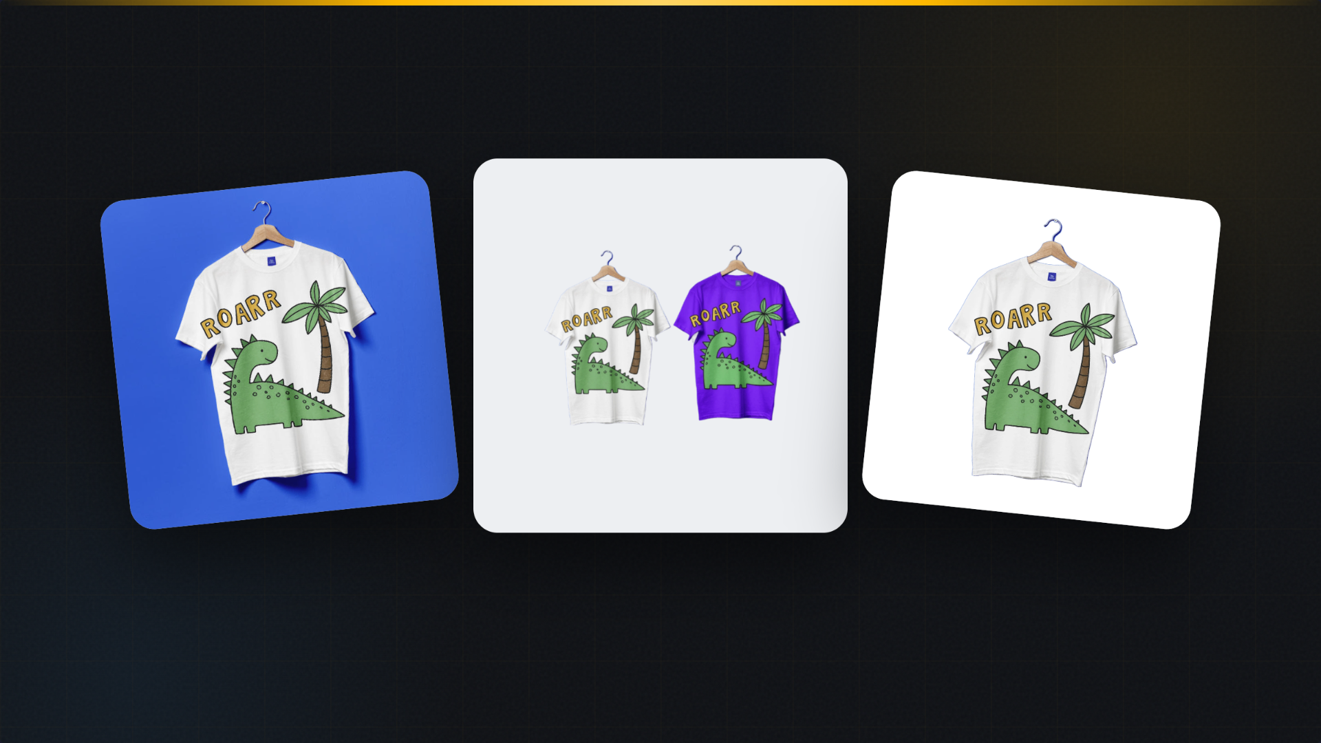
The short version: Etsy currently allows up to 20 photos per listing. You do not need all 20 to sell. A focused set of 10 images, each answering a different shopper question, covers first impression, alternate view, lifestyle context, print detail, color options, scale, clean background, what is included, a second use context, and one brand-consistent supporting image. This article is that shot list, with real print-on-demand examples. Source: Etsy Seller Handbook guidance on listing photos.
Most print-on-demand shops lose sales in the same place. The design is good, the product is good, and the listing has two photos: a front view and a slightly different front view. A shopper who cannot tell how big the mug is, how the print looks up close, or which colors exist will keep scrolling.
You do not fix that with better artwork. You fix it with a photo plan. Below is a ten-image plan you can repeat for every design you release. It is a starter set, not Etsy's maximum, and it is deliberately ordered so the images answer questions in the order shoppers ask them.
The 10-image plan at a glance
| # | Image | What it answers |
|---|---|---|
| 1 | Clear first image | What exactly am I buying? |
| 2 | Alternate product view | What does the other side look like? |
| 3 | Lifestyle context | Where would this live? |
| 4 | Close-up detail | How good is the print? |
| 5 | Color options | Which colors can I choose? |
| 6 | Size and scale | How big is it really? |
| 7 | Clean background | Can I see it with nothing in the way? |
| 8 | What is included | What comes in the set? |
| 9 | Second use context | Would this work as a gift? |
| 10 | Brand-consistent supporting image | Does this shop look reliable? |
1. A clear first image
The first photo is the one that appears in search results, so it carries the click. Fill the frame with the product, keep the design readable at thumbnail size, and resist the urge to add text or a collage. A shopper scanning a page of results is comparing shapes and colors in a space about the size of a postage stamp. Anything clever is invisible there.
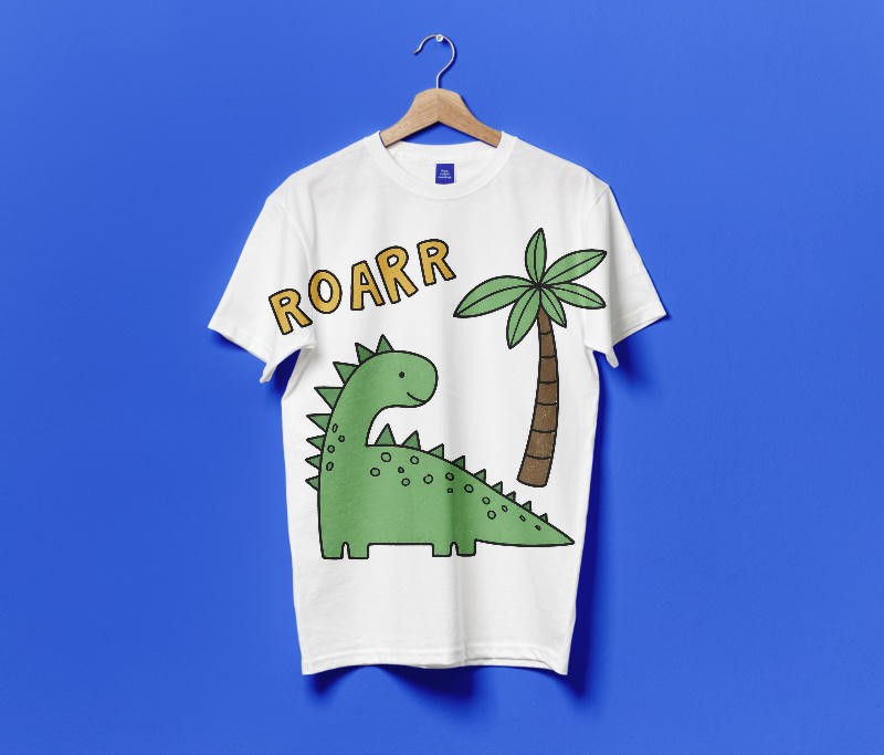
The practical test: shrink your first image to 200 pixels wide and look at it. If you cannot tell what it is, the photo is not doing its job.
2. An alternate product view
The second image should move. A different angle, a different product in the same design family, or the same item photographed from the side tells the shopper this is a real object and not a flat graphic pasted onto a template.
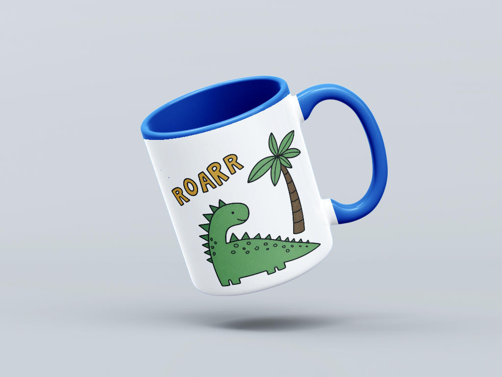
For apparel, that is usually a folded or hanging shot. For drinkware, an angled view showing the handle and the interior color. For posters, a slight perspective view that shows the paper has thickness.
3. Lifestyle context
Context images do something a studio shot cannot: they let the shopper picture the product in their own life. A mug on a breakfast table is not just a mug any more, it is a morning.
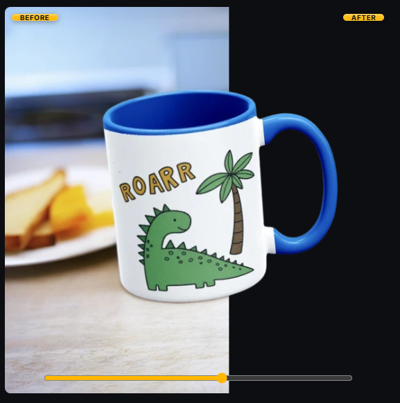
Keep the styling honest. Props should support the product, not compete with it. If a shopper has to hunt for your item in the frame, the photo belongs later in the set, not third.
4. A close-up detail
Print quality is the single biggest unspoken worry in print-on-demand. Buyers have been burned by cracked transfers and faded prints. A tight crop on the print itself, where the edges and the ink coverage are visible, answers that worry without a word of copy.
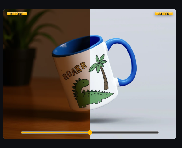
This is also where sharpness matters most. Export at a high resolution so Etsy's zoom shows crisp edges rather than soft, upscaled mush.
5. Color options
If your listing has variations, show them. A grid of the same design on four garment colors prevents the most common pre-purchase question you will ever receive, and it makes the variation dropdown feel real.
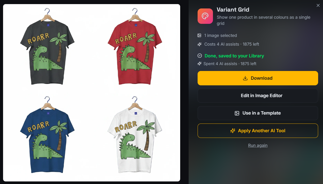
Order the colors the way you want them chosen. Put your best seller first. Keep the crop and the lighting identical across every swatch so the comparison is about color and nothing else.
6. Size and scale
Scale confusion causes returns. A poster that looked large on screen arrives the size of a postcard, and the review that follows is not about the artwork. Photograph the product next to something familiar, or show it in a room where the surroundings do the measuring for you.
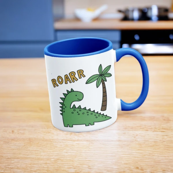
A simple dimensions graphic works too, but a real-world scale photo is more persuasive, and it does not risk the text-heavy look you want to avoid in the early slots.
7. A clean background
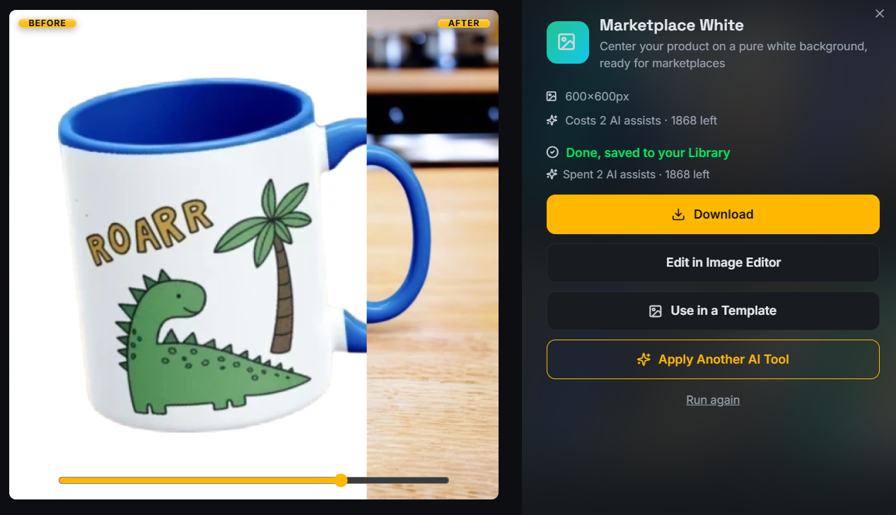
Somewhere in the set, give the shopper the product with nothing else in the frame. A clean white or neutral background image is the reference photo people return to when they are ready to decide. It also travels well: it is the version you reuse for ads, for other marketplaces, and for your own shop banner.
8. What is included
If you sell a bundle, a set, or a product with extras, show every piece in one frame. Ambiguity about what arrives in the box is a conversion killer, and it generates messages you have to answer manually.
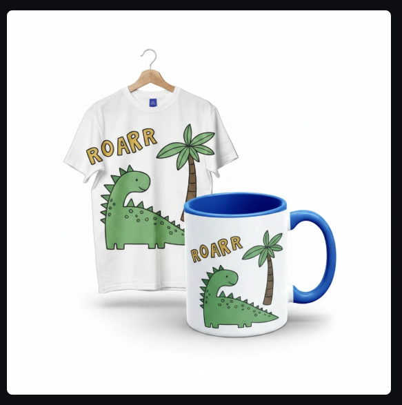
Even for a single item, this slot is useful: show the product with its packaging or its gift presentation if that is part of what a buyer gets.
9. A second use context
The first lifestyle image showed one use. This one widens the audience. A mug on a desk speaks to a different buyer than a mug on a breakfast table. A tee on a hanger in a bedroom reads differently to a tee worn on the street.
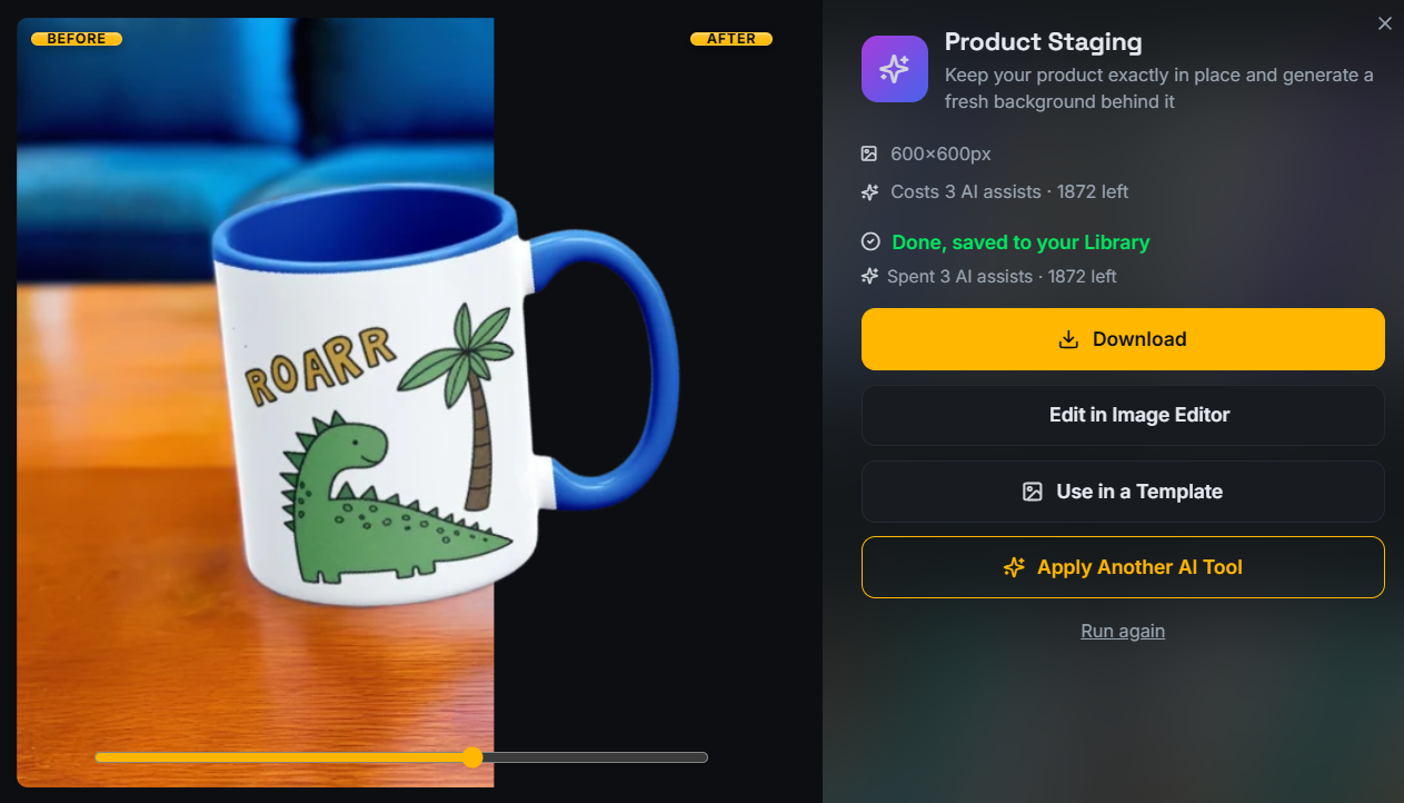
This slot is also where gift framing belongs. A large share of print-on-demand purchases are gifts, and a photo that says "this would suit someone else" widens the market for the same listing.
10. One brand-consistent supporting image
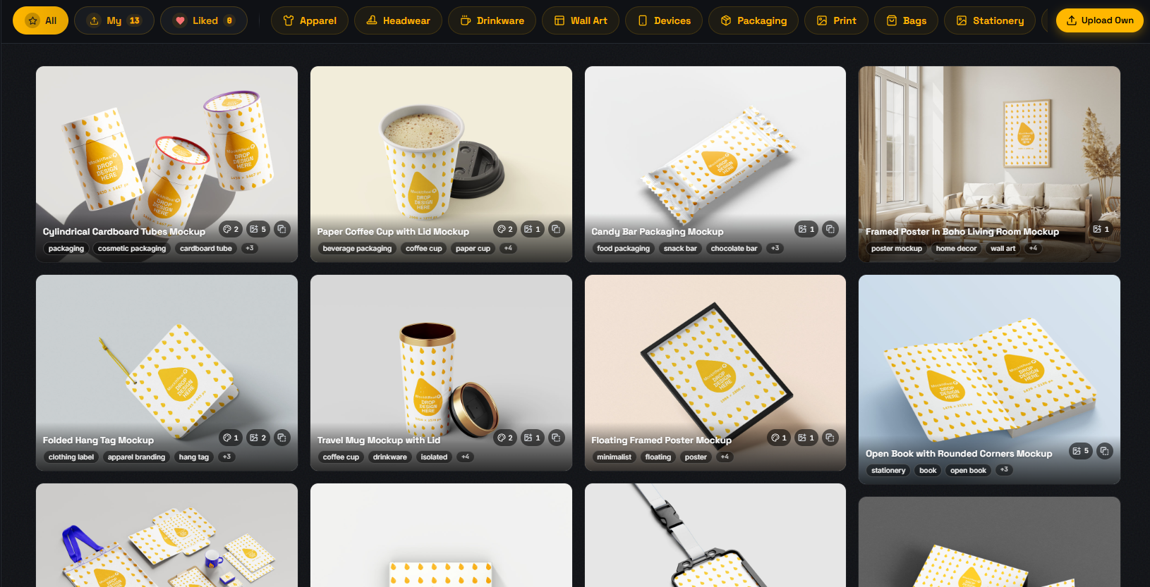
Finish with something that makes the shop feel deliberate: a collection view, a set of related designs, or a consistent branded frame you use across every listing. Shoppers open several of your listings before they buy. Repetition of a look reads as competence.
Ten now, more later
Etsy currently allows up to 20 photos per listing. Start with the ten above because they cover the questions that actually block a purchase. Once the listing is live and you see which questions still arrive in messages, add photos that answer those specific questions in the remaining slots. Source: Etsy Seller Handbook guidance on listing photos.
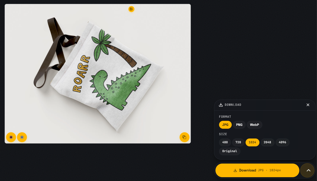
The reason to standardize on ten is speed. A repeatable set means your next design does not need a new plan, only the same plan applied again. That is where an Etsy mockup generator earns its place in the workflow: one upload, the same ten framings, the same look every time.
Before you upload
- Check the first image at thumbnail size.
- Export large enough that zoom stays sharp. The exact numbers are in Etsy listing photo requirements for POD sellers.
- Keep crops and lighting consistent across the set.
- Make sure every variation you offer appears in at least one photo.
- Reuse the same ten-slot plan for the next design.
FAQ
How many photos does Etsy allow per listing?
Etsy currently allows up to 20 photos per listing. Ten is a focused starter set, not the platform limit.
Do I need a camera to make these images?
No. Print-on-demand sellers usually do not own the physical product yet. Mockups generated from your design file cover all ten slots, including lifestyle and detail shots.
Which image matters most?
The first one, because it is what shoppers see in search and it earns the click. The supporting images are what help earn the sale.
Should I put text on my listing photos?
Keep text out of the first thumbnail. Etsy's guidance favours a clean product image there. If you need a sizing graphic, place it further down the set.
Can I use the same ten photos for other marketplaces?
Mostly yes, with resizing. See the product image size guide for the exact dimensions each marketplace prefers.
Reviewed against Etsy guidance on September 5, 2026.
Etsy is a trademark of Etsy, Inc. MockItReal is not affiliated with or endorsed by Etsy.